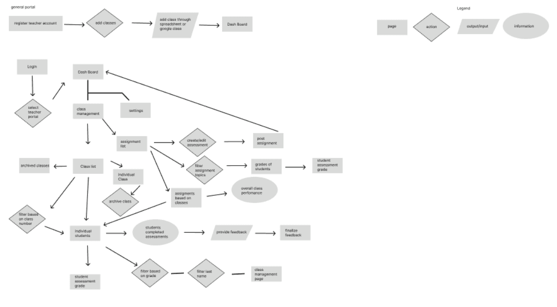
General Teacher Flow
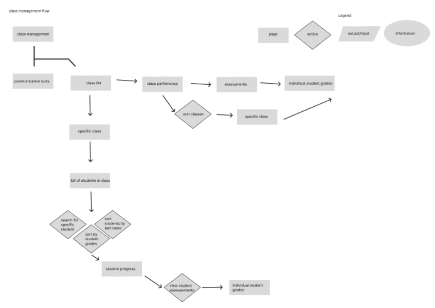
Teacher Class Management Flow

Redesigning and Optimizing MyEdMaster's Course Assessment Experience for Teachers and Students
Case Study: Creating a user-friendly platform to simplify assessment and enhance student performance and tracking for educators.
Role: UX/UI Design, UX Research, Sketches, Wireframe, Wireflow
Introductions
MyEdMaster is an innovative educational platform dedicated to improving learning outcomes for students from pre-K to grade 12 through scientifically validated teaching methods. MyEdMaster offers personalized tutoring in math, reading, writing, science, history, test preparation, and more.
Despite its robust offerings, the existing algebra assessment tool poses challenges for students and educators, making it difficult to navigate and utilize its full potential.
As the UX Designer for MyEdMaster, my role was to lead the redesign of the student assessment platform from research through to sketch and wireframing. I conducted Heuristic Analysis of current MyEdMaster platform to understand the needs of educators, parents, and students, and then translated these insights into intuitive design solutions.
I worked along with my team to improve the the usability of the assessment tool, making it easier for students and educators to track student progress and performance.
My focus was on improving the usability of the assessment tool for students. I created wireframes and sketches to visualize the new interface, ensuring that the platform would be both functional and user-friendly, with an emphasis on simplifying the assessment and tracking experience for students.
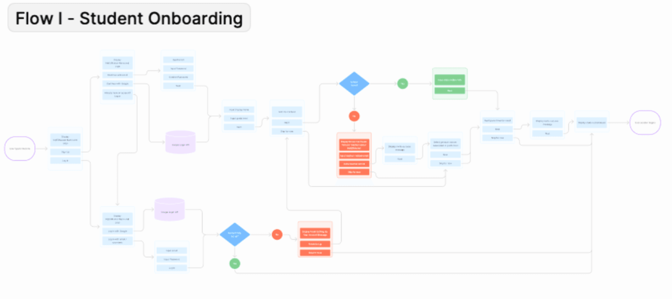
User Flow
The user flow for MyEdMaster was designed to create a seamless experience for both students and teachers, tailored to their unique needs. Students begin with a simple registration process, leading to a personalized dashboard where they can access courses, assessments, and progress reports.
Key actions, such as starting an assessment or viewing feedback, are easily accessible through clear navigation paths. For teachers, the flow includes an intuitive dashboard featuring class management tools, student progress tracking, and assessment creation.
By streamlining key tasks and minimizing steps, the user flow ensures efficient interactions, empowering users to focus on learning and teaching.
Reflection
Simplifying User Experience
Streamlining navigation and reducing unnecessary steps were crucial for improving accessibility and user engagement. A simpler, more intuitive interface allowed both students and teachers to interact with the platform more efficiently.
Collaborating Closely with the Client
Working closely with the client throughout the design process provided valuable insights into their specific needs and goals for the platform. This collaboration helped ensure the design stayed aligned with the client’s vision while also addressing the practical needs of end users.
Personalized User Flows
Creating distinct, personalized paths for students and teachers ensured that each group had access to the features most relevant to them, enhancing the platform’s effectiveness and user satisfaction.
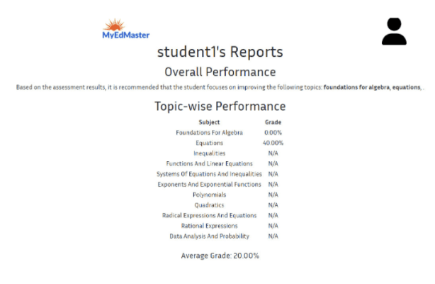
Transparent Progress Tracking
Providing clear, easily interpretable progress tracking was vital for both students and teachers. It encouraged engagement and allowed users to monitor their progress in a meaningful way, fostering motivation and continued use of the platform.
Heuristic Analysis
Match Between System and Real World
The heuristic analysis of MyEdMaster, based on Nielsen Norman Group principles, identified key areas for improvement. The Match Between System and Real World principle revealed a need for email confirmations and more engaging visuals on the homepage to enhance user confidence and reduce negative space such as the assessment screen page.
Aesthetic and Minimalist Design
Under Aesthetic and Minimalist Design, resizing the MyEdMaster logo and icons would improve layout balance, while distinct pages for students and teachers could create a more personalized experience.
Recognition Rather than recall
To support Recognition Rather Than Recall, consistent labeling, clear icons, and navigational aids like tooltips and breadcrumbs are recommended. These changes would simplify navigation, reduce cognitive load, and enhance overall usability.
Currently, MyEdMaster wants to enhance the user experience by:
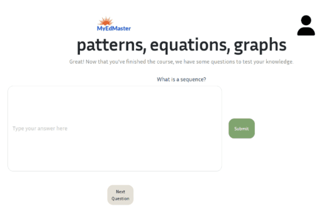
Improving the functionality of the algebra assessment tool that provides detailed performance analytics.
Creating a dedicated teacher portal that enable educators to access students key performance indicators
Tracking student progress, and improve their learning outcomes.
Enhancing the User Interface of the product to make it consistent, user-friendly, and simple to navigate.
Objectives
Competitive analysis
A comparison of MyEdMaster’s algebra assessment tool with Canvas, Khan Academy, and Pearson highlighted strengths and gaps in registration, dashboard usability, progress tracking, and ease of use.
Canvas and Pearson offer robust tracking but have complex navigation, while Khan Academy’s intuitive design lacks detailed insights.
MyEdMaster shows promise but needs improvements in navigation and progress visibility. These insights guided wireframe development to simplify registration, enhance dashboards, and improve assessment tracking for a more user-friendly experience.
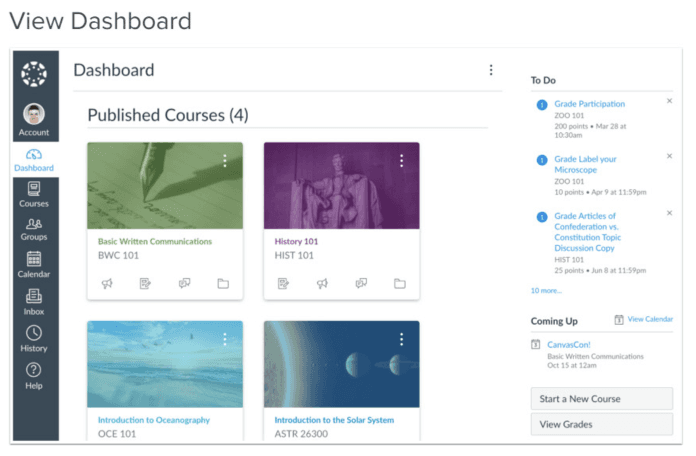
Canvas Dashboard: Intuitive and customizable
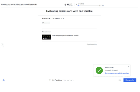
Khan Academy: Effectively validates student experience by providing insightful feedback on correct and incorrect answers.
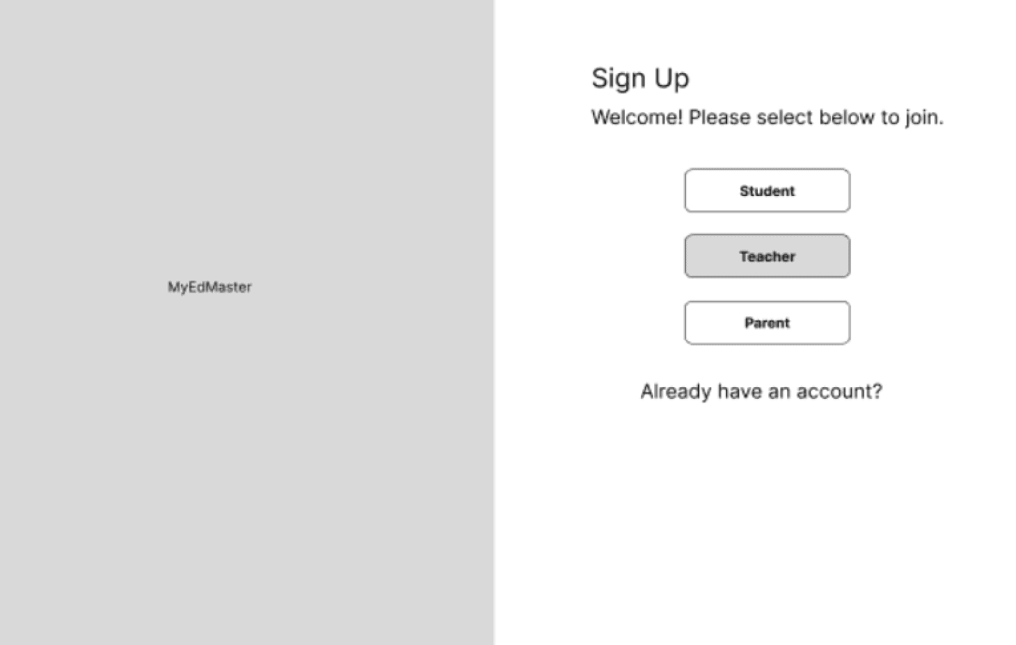
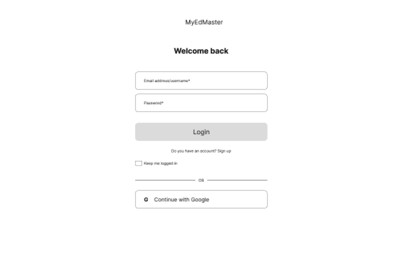
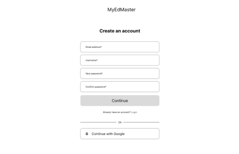
Pearson Login/Registration Page: Streamlined login and registration process with clearly defined options for student and teacher sign-in.

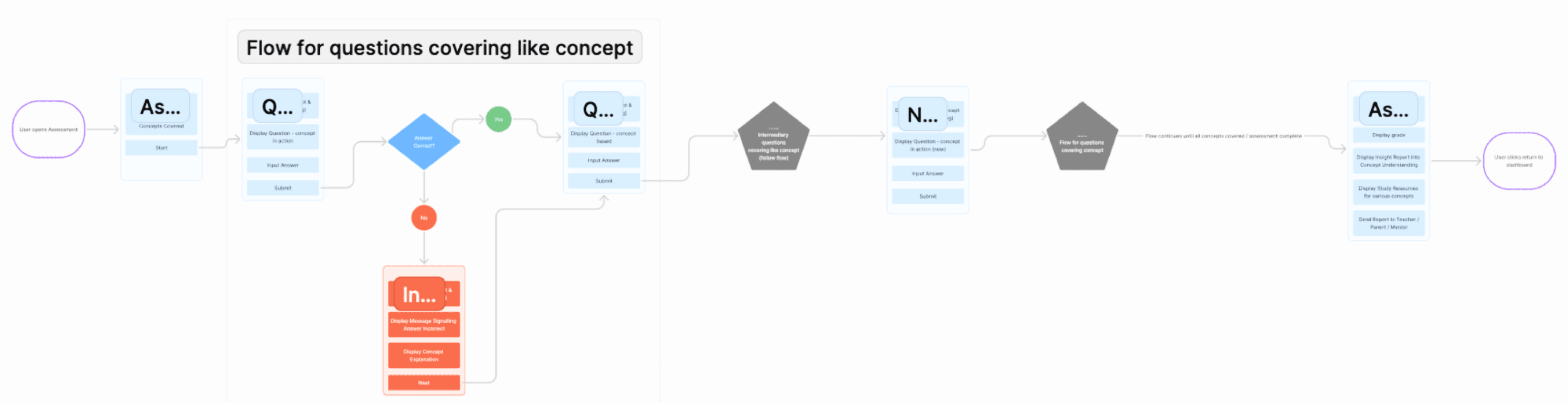
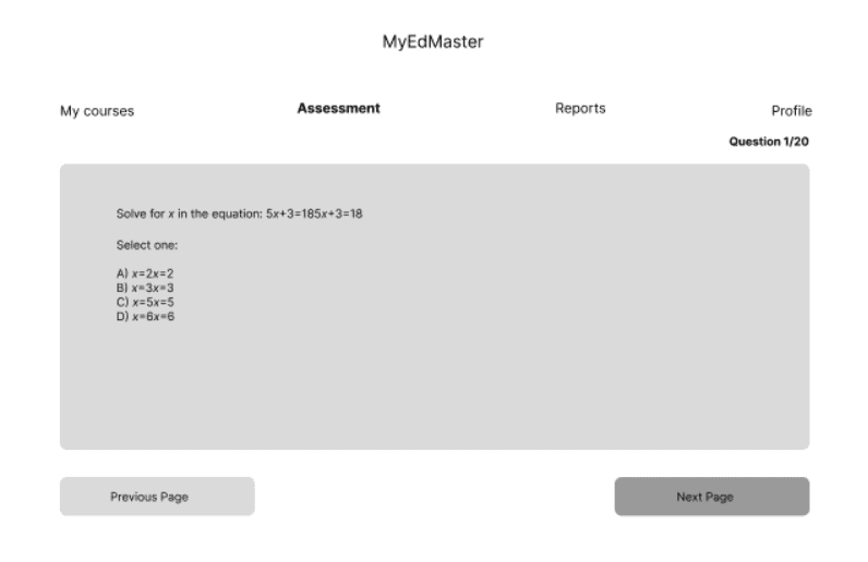
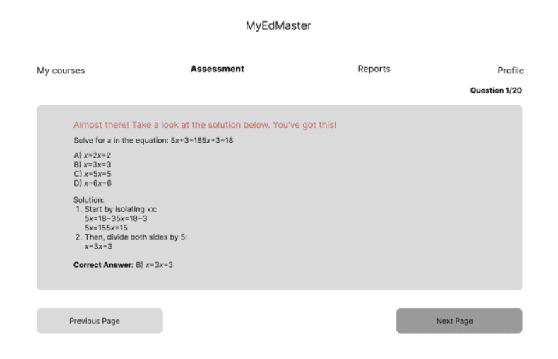
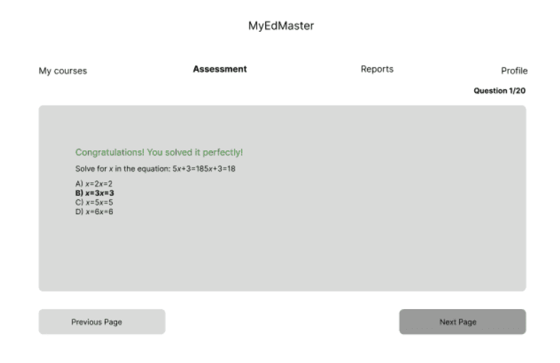
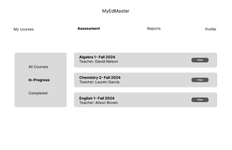
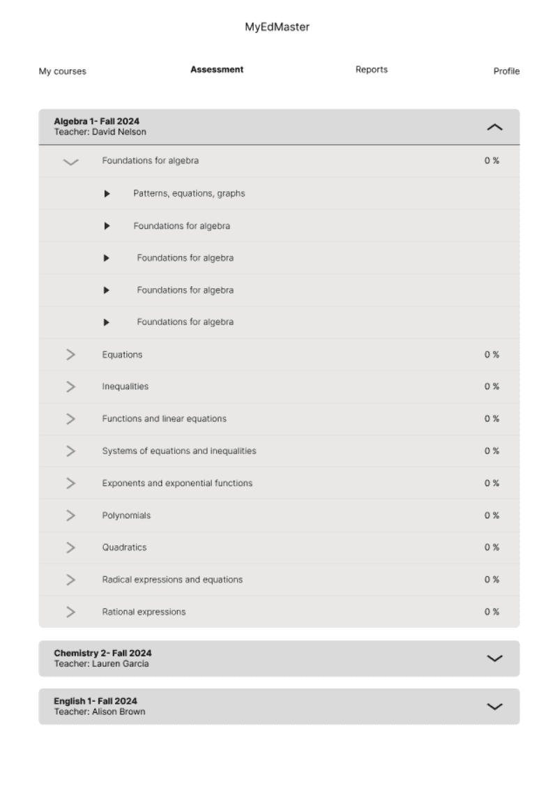
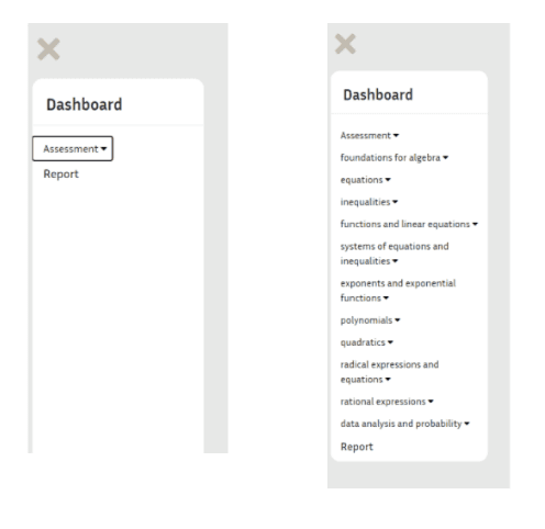
Wireframes
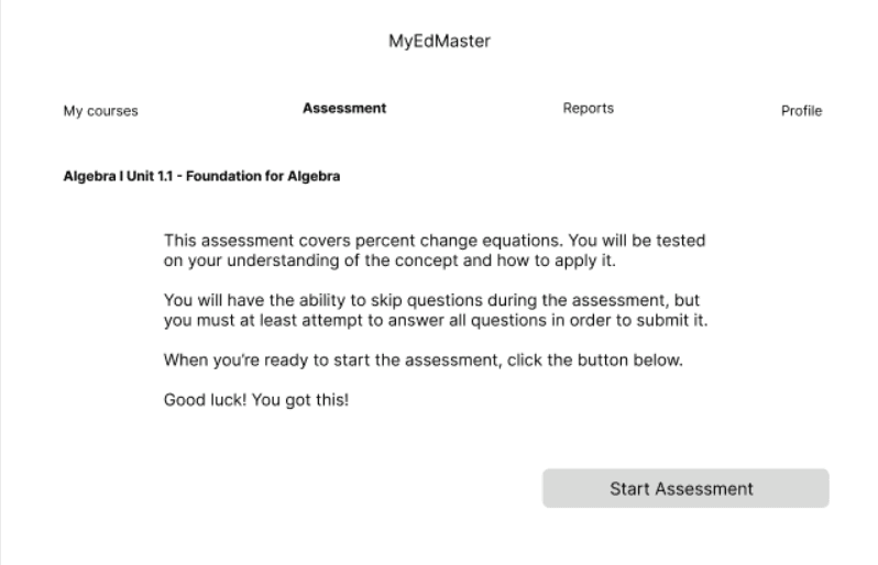
The wireframe for MyEdMaster was designed separately for students and teachers to address their distinct needs and workflows. The student wireframe focuses on providing easy access to courses, assessments, and progress tracking, with clear navigation paths to minimize complexity.
For teachers, the wireframe highlights tools for class management, student progress monitoring, and assessment creation, ensuring that these features are intuitive and efficiently organized.
Both wireframes prioritize simplicity, with consistent labeling, recognizable icons, and a clean layout to reduce cognitive load. These wireframes serve as the foundation for the platform’s design, offering a visual representation of how the platform will function and ensuring a seamless, personalized user experience for both student and teacher users.